Don’t hestitate to get in touch if you have a question or need more information!
Thank you! Your submission has been received!
Oops! Something went wrong while submitting the form :(
Virginia Highlands
Atlanta, Georgia
USA
This is how our team approached creating new features for one of the world's most loved brands.
This proposal centers on how Instagram might integrate a graphic layover feature and physical print option. The final product needed to fit within the iPhone app's existing user interface and design conventions. Information architecture could not deviate far from the existing layout.
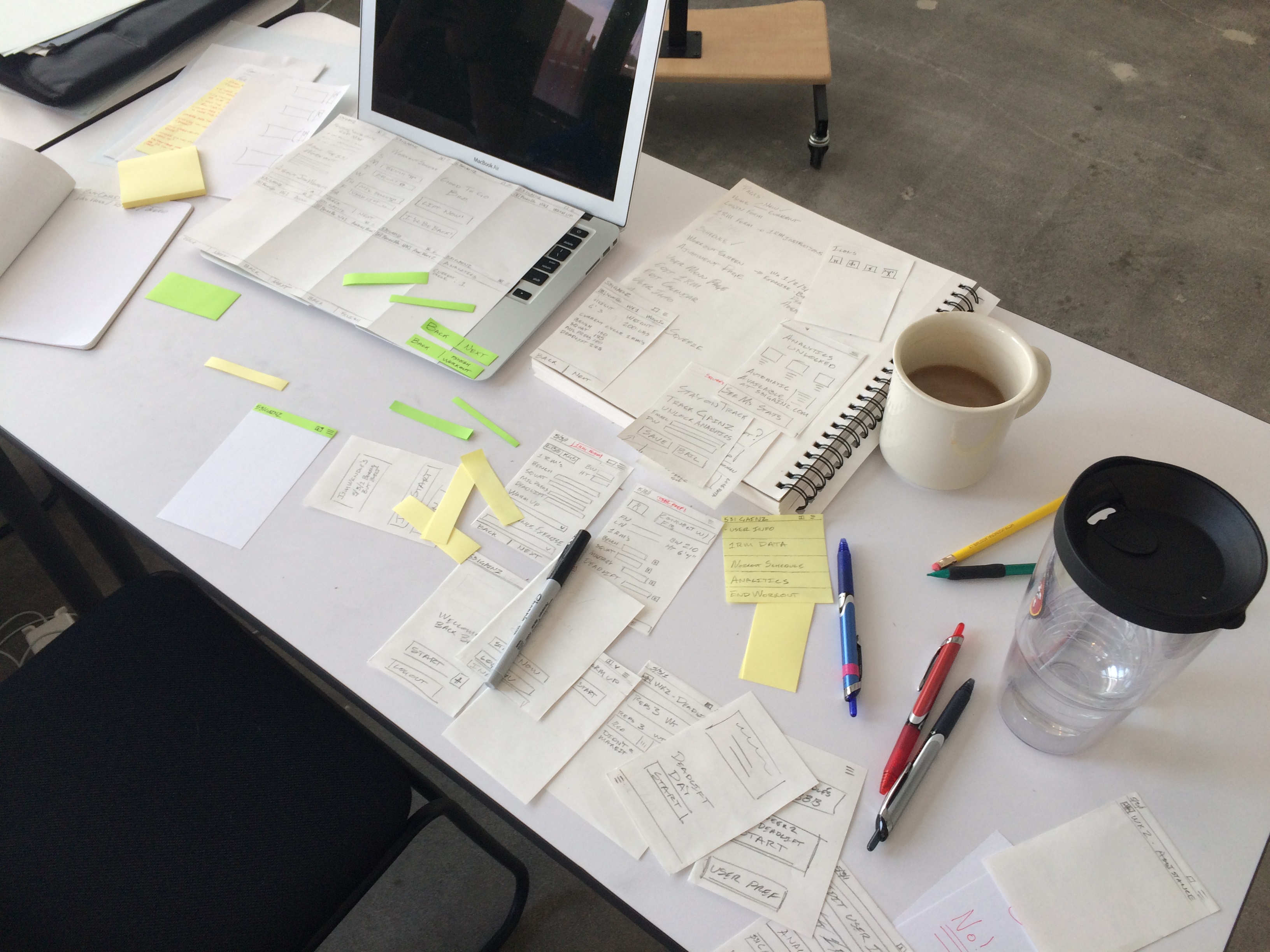
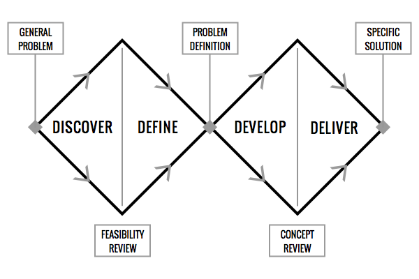
We approached this task using a hybrid Lean UX / Double Diamond Process Model. Research and user testing took place during the the first week. Ideation and sketching began immediately. We created two prototypes to test our ideas. Findings were presented at General Assembly in Atlanta, Georgia.
Double Diamond Process Model
Adding features to Instagram is easier said than done. The app is the most important part of the Instagram brand. To properly develop a text overlay and print option required us to research our standing in the marketplace, direct and indirect competition, and most importantly Instagram’s users.
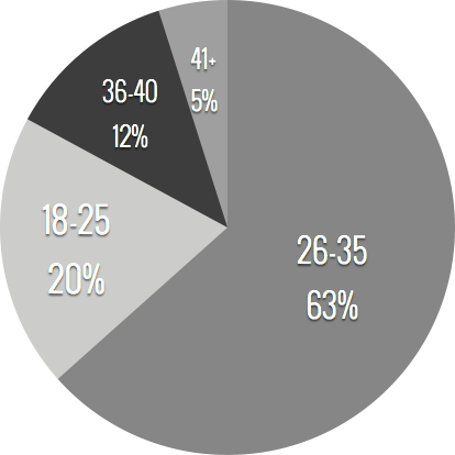
We began by surveying everyone around us. In many cases this meant asking strangers for a bit of time to answer some basic questions. We learned enough from these ad-hoc conversations to develop a deeper understanding of user needs. This information went on to inform questions in a more detailed email survey.
"Instagram is focused on simplicity and inspiring creativity through solving problems with thoughtful product design."
Instagram is an online mobile photo-sharing, video-sharing and social networking service that enables its users to take pictures and videos, and share them on a variety of social networking platforms. The app is known for it’s square images and image enhancement tools. In the beginning the app limited users to editing with filters, but has since expanded its offering to include lux and a number of other tools. Instagram also allows users to share images directly to other platforms including, Facebook, Twitter, Tumblr, Foursquare and Flickr.
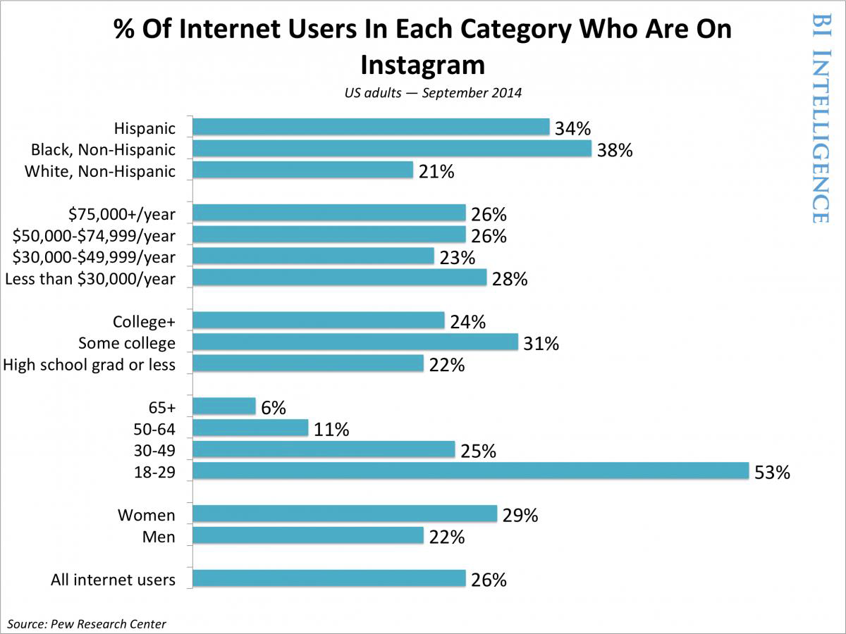
As of 2014 it reached over 300 million unique users and is among the most popular social networks in the world. According to a 2014 Pew Research Study the brand an audience of 21% of Americans over the age of 18. Forty-nine percent of its users engage with the site daily. Instagram maintains a strong brand identity through square photography, unified iconography and an easy to use platform.
The brand continues to grow. A Piper Jaffray survey found last year that Instagram reached 83% penetration among female upper-income teens, ahead of even Facebook. Additionally, Twenty-nine percent of adult women internet users in the US are on Instagram. The brand is equally strong with men boasting 22% of male US internet users.
Instagram was purchased by Facebook September 2012 and launched an ad platform in late 2013. The brand has been careful to maintain the image that made it popular, limiting the amount of ads to date.

“Check out this pic of trail I hit this weekend. So rad.”
Driscoll is a 28 year old college graduate working in the financial services sector. He enjoys hanging out with friends, outdoor activities and craft beer. Driscoll is an average american male that likes to share and capture his experience through social media with little desire to gain followers or represent a brand.
Followers: 300+
Use: Social
Frequency: Daily
Perception of Instagram Brand:
Cool, Fun, Trustworthy
Favorite Brands:
Patagonia, Spotify, Levi's

“I’m always looking for a new way to share my work.”
Paul is a 33 year old Hair Stylist and Entrepreneur. He uses Instagram to promote his services and self-branded product line. He also enjoys browsing Instagram for inspiration. Octavio is very active in the yoga and running communities. He loves snapping pictures of his many travels.
Followers: 2500+
Use: Social, Personal branding
Frequency: Weekly
Perception of Instagram Brand:
Addicting, Creative, Entertaining
Favorite Brands:
Uber, Diesel, Asics
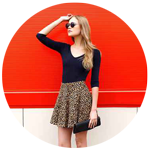
“Wait!
I don’t have the new update.”
Madison is a 23 year college graduate working in fashion retail. She loves fashion and uses Instagram to make mood boards with her pictures. One of her hobbies is designing jewelry that she sells on Etsy. Madison is always looking for new ways to be creative and connect with her customers.
Followers: 1000+
Use: Social, Marketing
Frequency: Compulsively
Perception of Instagram Brand:
Inspiring, Trendy, Creative
Favorite Brands:
Anthropology, Whole Foods, Tumblr
Instagram is a very simple app, but there are a lot of nooks and crannies. This sitemap gives an overview of the iPhone version of the app as of July 2015. Dark squares are existing pages, white squares are pages we intended to add. Click the image to see full size.

With deeper understanding of my challenge I began considering user flow. Simplicity was paramount, but I wanted users to keep using the app. I realized that a basic registration/login process that was encouraged but not required might achieve this goal.
Our early prototype uncovered some areas we could improve interactions. We found our original user flows worked for most people, but transitions between steps and back navigation to need work.
“As a new user would like it if the forward and back icons were consistent.”
"The print icon is kind of confusing"
InVision served as our test bed from start to finish. The interface was clear and easy to use. The app allowed us to test natively on an iPhone, rather than through a mockup on a laptop. This feature is now standard for many prototyping platforms, but at the time it was fairly innovative. Overall we were pleased with its performance.
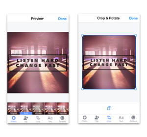
We knew going in that we would need to create some new icons to represent functions within the app. Instagram has a very unique way of representing the functions of tools within the photo editor. Mimicking that style was easy enough, but communicating meaning took time. Interestingly, the printer icon proved to be the most troublesome. We originally opted for an icon that represented a modern printing press, but few users understood this. In the end we opted for a traditional desktop printer icon. While not as beautiful as the printing press, it best represented intent.
When it came to editing text we found it necessary to provide two methods to navigate out. While this is redundant it made the experience far better for brand new instagram users. We made a point to make forward and back navigation easy to understand as many users wanted to edit their progress.