Don’t hestitate to get in touch if you have a question or need more information!
Thank you! Your submission has been received!
Oops! Something went wrong while submitting the form :(
Virginia Highlands
Atlanta, Georgia
USA
531 Gainz is a mobile app designed to calculate, manage and track the popular 5/3/1 strength training regimen for athletes in a gym setting.
Strength training has been growing in popularity across the world. One of the most safe and effective training methods is the Wendler 5/3/1 System. After a friend mentioned a lack of usable apps for the 5/3/1 strength training program, I began thinking about how the problem could be solved.
This was a rapid prototyping exercise.
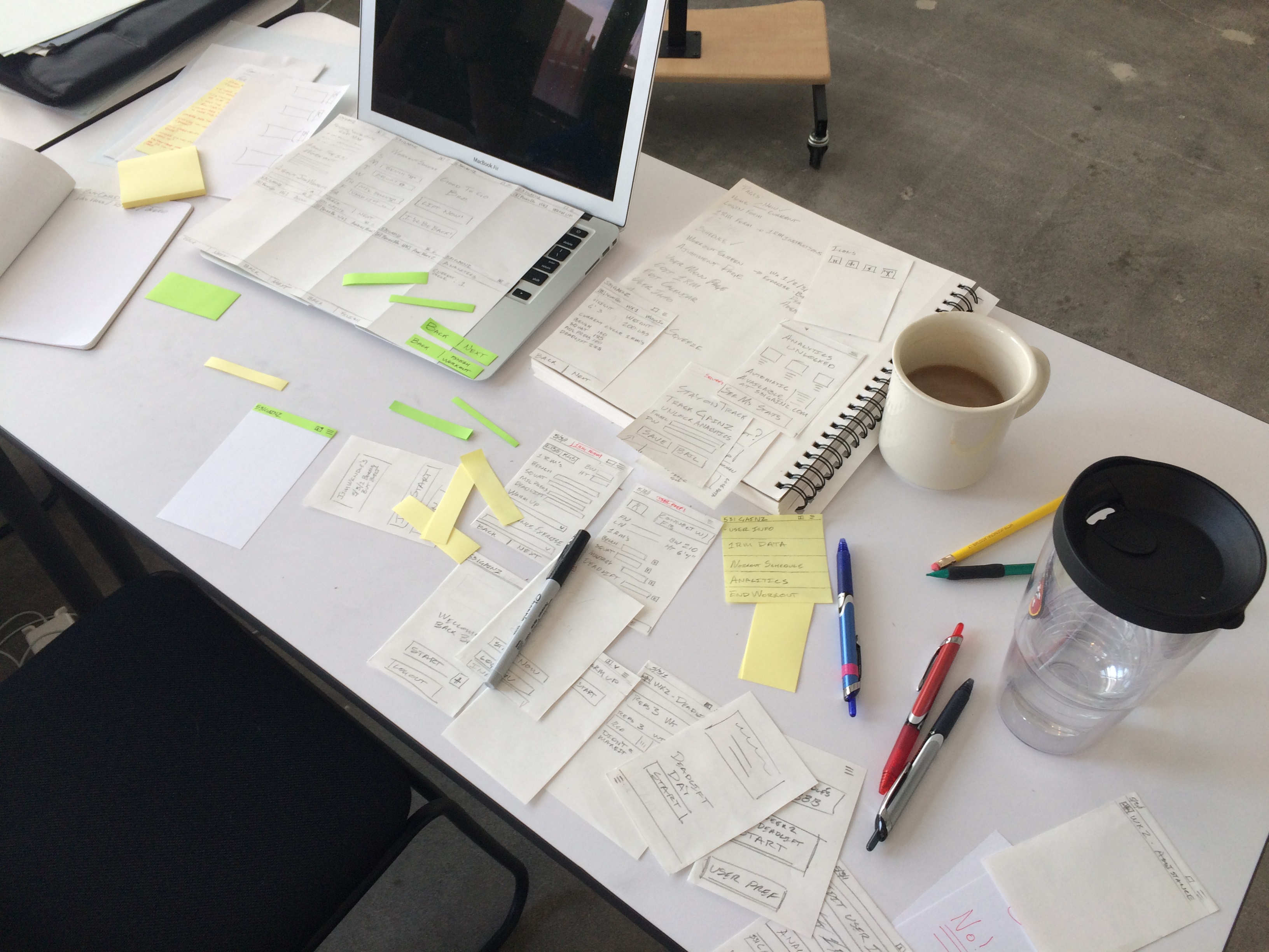
The concept was conceived, researched and developed over three days in a rapid prototyping environment. All research and development for the project. Prototypes were created using post-its, note cards and the POP app.
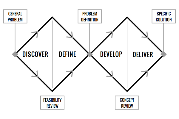
I approached this task using a hybrid Lean UX / Double Diamond Process Model. Discovery and definition were critical to understand and organize the problem. The first one and a half days were dedicated to discovery and definition of the task. User interviews and market research were conducted with ideation in the form of sketching taking place throughout. Once a loose plan had been established development began with a heavy emphasis on iteration. Development and Delivery took place rapidly following the development of a design plan.
Double Diamond Process Model
The Wendler 5/3/1 System is a safe, popular, but complicated routine for strength training. The athlete must calculate specifics of their routine based on key weightlifting metrics according to a unique mathematical formula. User stats like height, weight and one repetition max lifts are used to determine future workouts.
Calculating and maintaining a regimen can be tedious for both novice and professional powerlifters. Apps do exist for the 531 workout regimen, but most athletes print their workout plans and track progress through desktop spreadsheets.
Strength athletes take their sport very seriously. Users I interviewed took pride in understanding the physiological reasons for various routines. Simplicity trumped features. During user interviews three core themes became clear. A better 5/3/1 strength training app must:
“I hate how some apps have tiny next buttons. I don’t like breaking my focus to search an app when I am just trying to finish a workout.”
With an understanding of user needs and a reference point for what existed on the market I began sketching potential solutions.
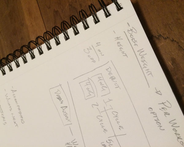
I began sketching as soon as I had the basics of the task. Early sketching focused on conceptualizing how an interface might look. Along the way I compared how apps in the space had chosen to layout and segment their user flow.
Once I had completed research, user inquiries and developed a user flow I revisited my early sketches. A general layout began to shine through.
After sketching the basic layout of the app I began using index cards and post-it notes to create screens. Post-it notes allowed for quick changes to the headers, footers and elements that changed on any given screen. This method saved time while allowing for rapid iteration on existing designs.
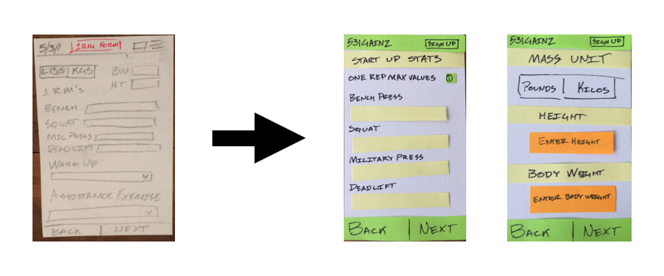
POP APP Prototype on Paper, better known as POP App is a low fidelity, no cost tool for building clickable prototypes. The app takes a minimum viable product approach to prototyping. While at times glitchy, the limitations of the app act in some ways as advantages.
Pushing pixels takes time and can reduce the flexibility to iterate. My choice to accept a low fidelity prototype as a final product led to a faster, more efficient ideation process. Elements of the user flow had to change at various points. Sticking to paper allowed me to make changes in minutes that would have taken hours in software.
The app attempted to incorporate the language and memes of the weightlifting community without being overbearing. In multiple cases, this humor transcended beyond the gym.
Lorem ipsum dolor sit amet, consectetur adipiscing elit. Suspendisse varius enim in.
Lorem ipsum dolor sit amet, consectetur adipiscing elit. Suspendisse varius enim in.
Lorem ipsum dolor sit amet, consectetur adipiscing elit. Suspendisse varius enim in.
Lorem ipsum dolor sit amet, consectetur adipiscing elit. Suspendisse varius enim in.
Need more information?
Get in touch!

Lorem ipsum dolor sit amet, consectetur adipiscing elit. Suspendisse varius enim in eros elementum tristique. Lorem ipsum dolor sit amet, consectetur adipiscing elit.
Lorem ipsum dolor sit amet, consectetur adipiscing elit. Suspendisse varius enim in eros elementum tristique.
Lorem ipsum dolor sit amet consectetur. More info ›
20 commodo diam
Libero vitae
Lorem ipsum dolor sit
Aenean facibus nib
Lorem imperdiet
50 commodo diam
Libero vitae
Lorem ipsum dolor sit
Aenean facibus nib
Lorem imperdiet
99 commodo diam
Libero vitae
Lorem ipsum dolor sit
Aenean facibus nib
Lorem imperdiet
Lorem ipsum dolor sit amet adispcing elit viveraa ornare. More info ›